Under Armour product customization engine

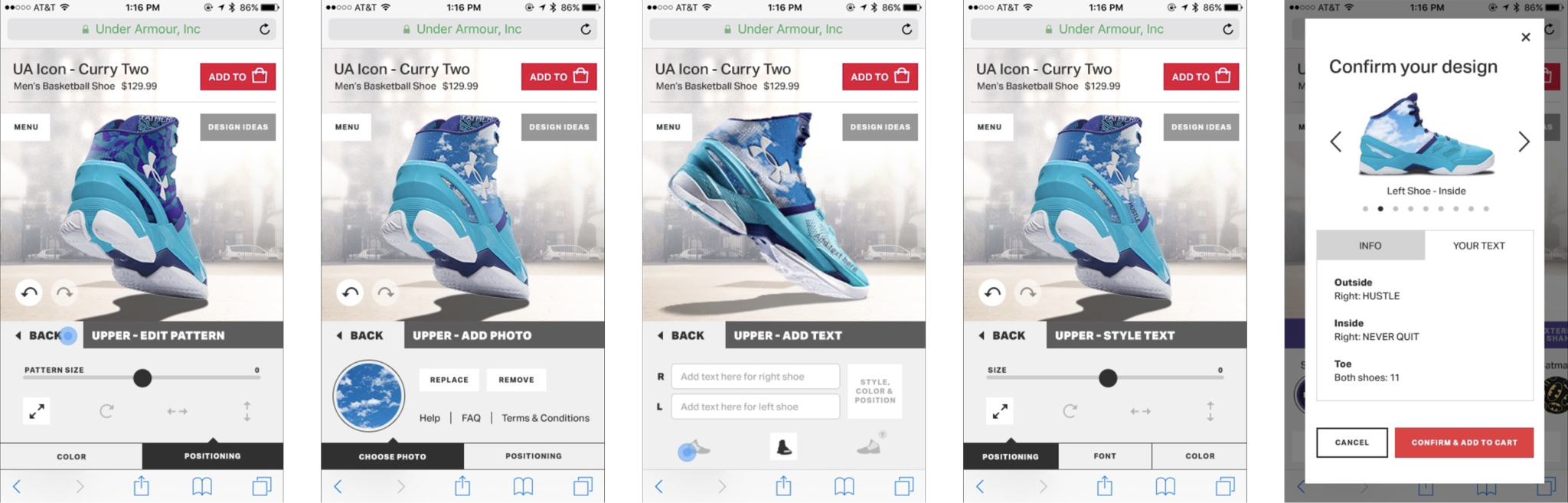
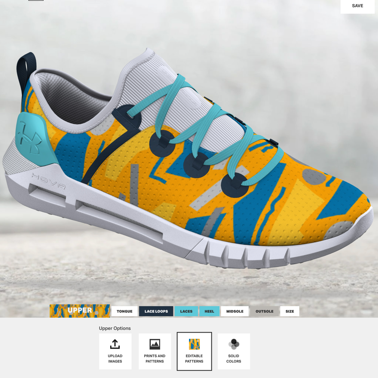
Put literally anything on a shoe*

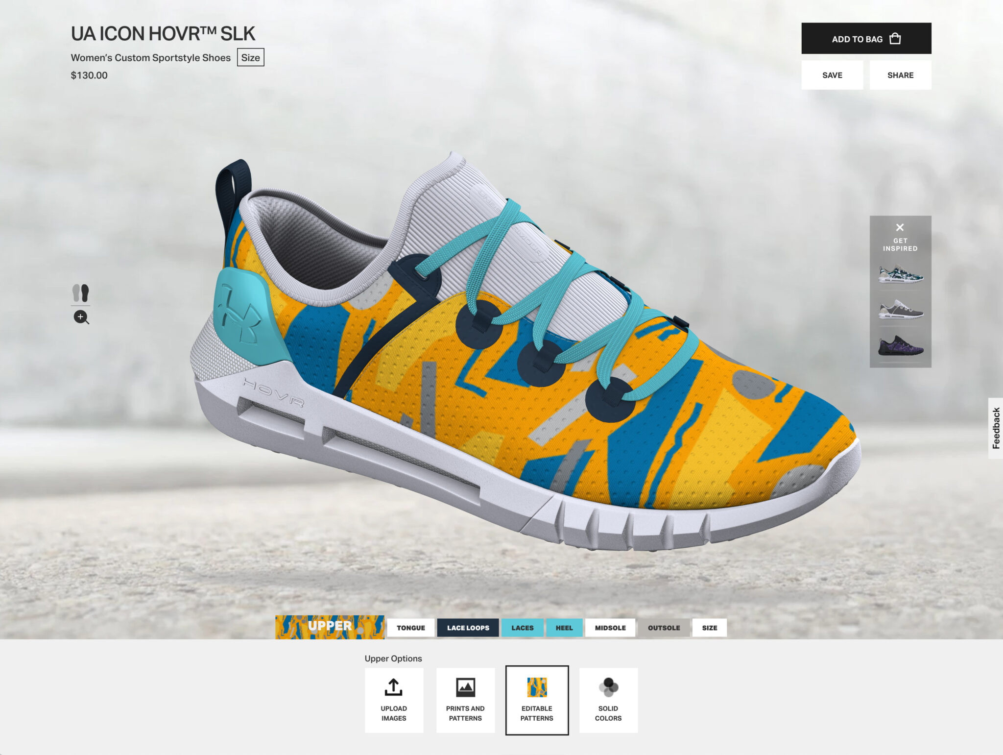
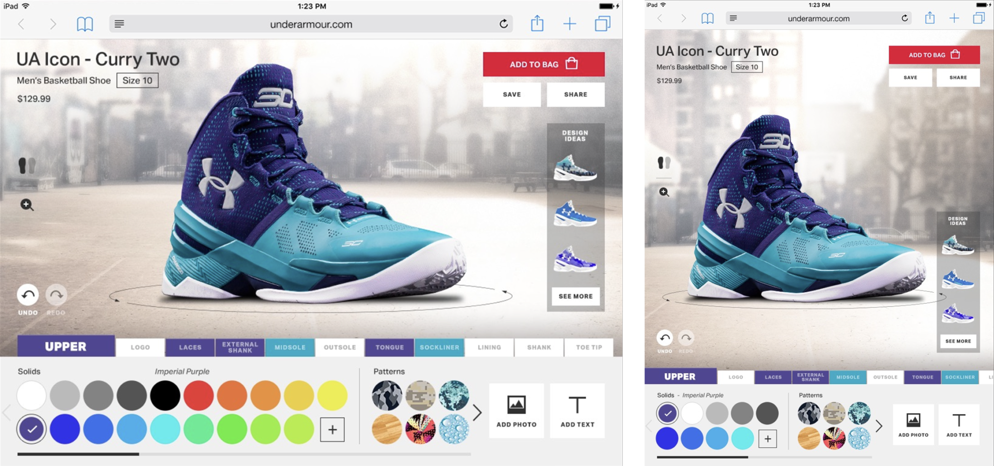
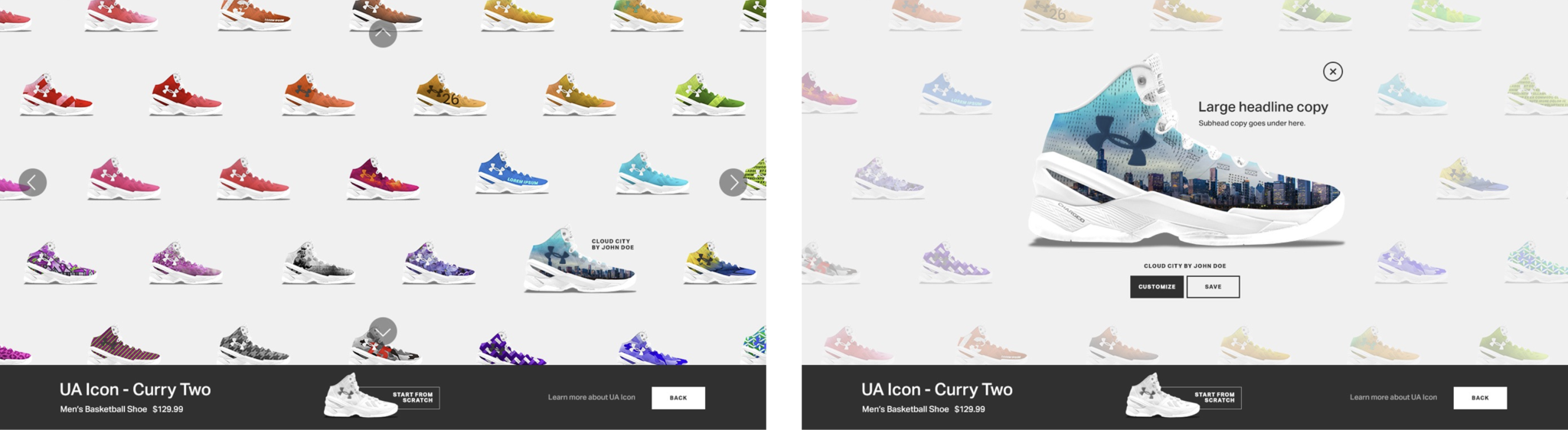
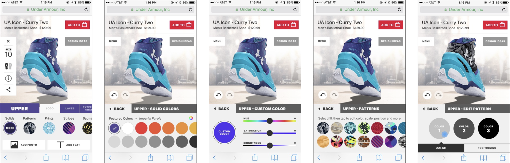
The Under Armour Icon web app let users customize dozens of shoe parts, and add color, patterns, type, and even photos to shoe uppers. We had to understand the opportunities and limitations of WebGL and understand the manufacturing process so that our tools would produce reliable renderings and accurate outputs leading to satisfied customers. We also had to balance between mobile compatibility and supporting repeat expert usage on desktop – we wanted creators to use it as a platform and share designs. In my role as lead UX, I contributed research, design, creative direction, and product functional specification. I was the lead interface with the enormous client team and engineering contractor.
* Of course there was a blocked words list which included other sneaker brands

Ollie ecommerce workflow

Eating your own dog food

I can’t resist a challenge so when the Ollie CEO told me he had tried their “human grade” dog food himself, I knew I too would have to “dogfood” the product. I had to get to know the direct-to-consumer brand top to bottom anyway. It tasted fine, but needed some salt. Ollie had established a solid customer base and was looking to transform from a single product customization ecomm workflow to a rich product and service platform. They had to retain the brand attitude and ensure an easy and friendly user experience in a system with a lot of complex options and decisions. I consulted with the CEO and other company leaders to deliver a solution in a dynamic environment where the team’s ability to focus on design was severely constrained. Deliveries included an updated information architecture and a full featured figma prototype which took care to respect the existing storybook component library.

Opticlose app and brand identity

Always call the right lead

Opticlose was a sales acceleration tool that used regression analysis to predict the best prospect for a salesperson to engage with at the current moment. Initially targeted at telesales, it used a bidirectional sync with Salesforce to harvest realtime data for regressions and then present a streamlined UI for recording call outcomes. This “fed two birds with one scone” by solving the twin problems of not knowing who to call and Salesforce being hard to learn and use all day. I made a punchy brand to stand out in the ubiquitously bland universe of sales enablement tools, since word of mouth and user trials were key marketing channels for us. I was responsible for brand, design, front end coding, and engineering management and roadmap. I also did embedded research with customers and their users, presentations to investors, and coded a working prototype in AngularJS which we transitioned into our live alpha product.

Syndio product design and data visualization

Growing an equitable pay platform

Syndio promotes fairness in the workplace by helping companies analyze and improve on equal pay, pay policy, representation, and career paths for women and underrepresented minorities. Centered on applying regression analysis to labor economics data, the products had complex UIs with profound cultural and legal implications. In addition to hands-on design, as a principal I collaborated across the entire org, advised leadership, led critical initiatives, and mentored designers and product managers. We delivered several new products, a well documented storybook design system, platform strategy, ML strategy, a support chatbot, and an ever growing set of complex, high stakes data visualizations. I also delivered extensive research on data integration, a complex data integration workflow, and a powerful data transformation UX.

Racket 1.0 iOS app

Every team is a remote team

Inspired by the rising popularity of airpods, my partner and I were funded to do a startup called Racket to imagine how hybrid teams could communicate with always-on audio. The idea was to make conversations effortless – with all the spontaneity and serendipity of working in the same space. The solution was to extend the current mode of remote collaboration, messaging, with audio – imagine Slack but if it was multi-modal – long before Slack huddles was launched (and with a better UX). Racket let you listen and talk in text conversations and have synchronous audio conversations in a channel that others could read or listen to later. Seamlessly move between text and voice to fit your context and benefit from the strengths of both asynchronous and synchronous communication. We designed and built out authentication, onboarding, invites, user management, channels, audio playback, audio emoji, and an admin console. Racket was built on WebRTC architecture, and featured multichannel recording for speaker isolation and transcription, smart muting for team members in the same room and a bunch of other novel features. As one of two founders I compiled a massive competitive analysis, designed and specified all the product features, ran QA, and wrote the patent.

Syndio design system and storybook specification

Invisible design

The Syndio design team created a new design system when we designed the second product in the platform, then gradually retrofitted the existing product to fit the new system as time and focus allowed. Because Syndio’s product UI was primarily data visualization and decision making oriented, we wanted a super minimal presence for our design elements so that content could be the focus. We built out a drag and drop library in Figma including all icons, form elements, color and type specifications, template features, template spacing, etc. We worked across siloed dev teams to build storybook specifications, including custom components to meet specific needs, evaluated frontend frameworks for capabilities, and managed transition to Mantine, Tanstack and others. Accessibility was core to everything. We also extended documentation by writing a library of detailed template specs to provide engineer guidance on composing screens using components to drive consistency and reduce review cycles.

Racket 3.0 iOS/Mac apps and brand identity

Lemon, lime, mango and papaya

A pivot for Racket toward productivity, 3.0 was a collaborative canvas and audio communication platform on Mac Desktop and iPhone. In addition to updating existing Racket features, we added synchronization and collaborative collision rules for the canvas, and I contributed hands-on UI design directly in Swift for a number of elements. I gave it a brand design that embodies collaboration through the progression of color and repetition of layers, creates a language of bold simple shapes, evokes the product name with a subtle letter R, and incidentally looks like delicious fruit. A fun and inviting brand that could appeal to both business and consumer users, with key deliverables of an app icon, app store presentation, and desktop/mobile website that mimicked the product UI.

Verizon self-service and ecommerce

“Bell Atlantic”

I was an interaction design director on the 135 person team at R/GA that managed the web presence for the former Baby Bell, now grown into the nation’s largest wireless carrier. I managed and mentored 11 UX designers on the Verizon team in a role that mirrors that of a present day product manager – estimating project cost, planning roadmaps, and specifying features in addition to designing wireframes and building prototypes. I led key initiatives personally, including redesign of their main self service portal, the exceptionally complex ecommerce workflow, an integrated messaging and productivity platform, and a skunkworks vision project charting Verizon’s role in the future of consumer tech. We performed extensive user research across the country, including user testing, focus groups, ethnographic studies, card sorts, and quantitative surveys. I collaborated extensively with all levels of stakeholders to deliver information architectures and change management plans as their business became more digital.

Comcast strategy and ethnographic research

Listen, then help me

Cable companies are consistently the most reviled brands in the U.S., and Comcast was no exception, topping the charts at the time as literally THE most hated company in America. We took the opportunity of doing an extensive ethnographic research project around support (24 in-home interviews in 3 metro areas) to understand practical needs, but also how we might rehabilitate the brand from top to bottom via the digital channel. In classic HUGE fashion we delivered a punchy deck with personas, digital strategy, and our aspirational take on how to fundamentally shift the business. We never solved their abusive and misleading pricing practices, but you can’t blame a team for trying.

Patch Perks mobile app

No more paper punch cards

Buy 10 bagels and get one free without the overstuffed wallet. The Patch Perks platform monitored credit card transactions in order to capture purchases at local businesses who were enrolled. The iOS/Android app let users sign up with businesses and notified them of progress on loyalty campaigns and other offers based on timing and location. The platform was designed to complement advertising and self service content creation by businesses on their town’s Patch local news website. I managed the interaction and visual designers and provided high level product management guidance and creative direction.

iHeartMedia self-service ad platform

“The radio craze … will soon fade.”

—Thomas Edison, 1922

Wrong then, and still wrong today. “Terrestrial” radio remains popular even as it transitions to streaming, and audio content and advertising are only growing. IHeartMedia needed to expand targeted radio advertising to a much wider field of smaller advertisers by reducing the overhead costs and pricing for radio ads. Our small team delivered a 0-1 design and spec for a self-service audio advertising platform that would offload content creation from small businesses, simplify market selection, track and verify campaign runs, and manage budgets based on results. It had a super simple wizard UI with limited, intuitive choices on each step and help easily in reach. We consulted with senior executives to develop the concept, tested on a full prototype, and delivered final design and specs.

HBO.com

Golden age

HBO.com was a next level web experience for a next level brand. One of the first websites to incorporate full frame video and provide content that extended the television experience into interactive. I was lead UX. My team had to dive into extensive content analysis to understand the scope of content and customer connection to HBO verticals. Fortunately this involved watching a lot of great TV, comedy, and sports, least among it the show Entourage, pictured below. We developed an information architecture with key exec stakeholders, collaborated with show-runners to brainstorm web content extensions, and performed usability testing. We delivered more than 500 pages of UX documentation and product specification, including a video player, full featured program guide, user authentication, and message boards – all designed from scratch.

HBO.com Homepage

Commure integrated medical systems prototype

HMS and EMR drive HCPs to GTFO

Healthcare professionals (HCPs) face an onslaught of documentation. It’s so bad, it actually causes a significant level of burnout and employee attrition. People spend all day on the computer instead of helping patients, get overloaded, and decide they can’t make it work. The root of the problem: a near total monopoly on Healthcare Management Systems and Electronic Medical Records by just two companies. With zero incentive to improve software usability, these companies have made zero investment in their UX. Commure was a (very well funded) angel stage healthcare startup with ambitions to take on and disrupt the monopoly holders (Epic and Cerner) by making software that actually works for users. My partner and I did a vision project for them covering two key areas – excessively difficult data entry, and fractured data views. We did research with eminent medical professionals and leaders including onsite ethnography at UCSF and delivered a code/design hybrid prototype. It could transcribe doctor/patient conversations and identify medically relevant tokens like conditions, medical orders, and medications and provided an integrated longitudinal visualization of patient status and medical records. We worked with the CEO and presented to the board and key investors. Commure is delivering on the promise of their initial concept – they’re valued somewhere north of $6 billion, closing a $200 million round in 2025.

Bose Channels team communication app

Giving people control of our most important human sense

We collaborated with the legendary Dan Gauger, the pioneer of active noise cancelling at Bose in their innovation group to explore new product ideas. We fleshed out 7 hardware/software product concepts from noise cancelling rooms, to headphone traffic lights, to audio-neural stimulation. My partner and I built out a working prototype of one concept that integrated the touch controls in their headphones and glasses hardware to make team communication a double tap away (a single tap sounds better, but it’s actually too close).